--------------------
AMSTERDAM TANNING & CAFE – IDENTITY
Amsterdam Tanning & Cafe is a spot with a double aim: guests have the option of using tanning beds, while they can also meet up with friends next to a nice cup of coffee or a fresh, healthy meal.
It was important for the logo to be useable across a wide range of platforms, as 'Amsterdam' will not only be the name of the tanning salon and cafe, but also of healthy food and drink products.
--------------------
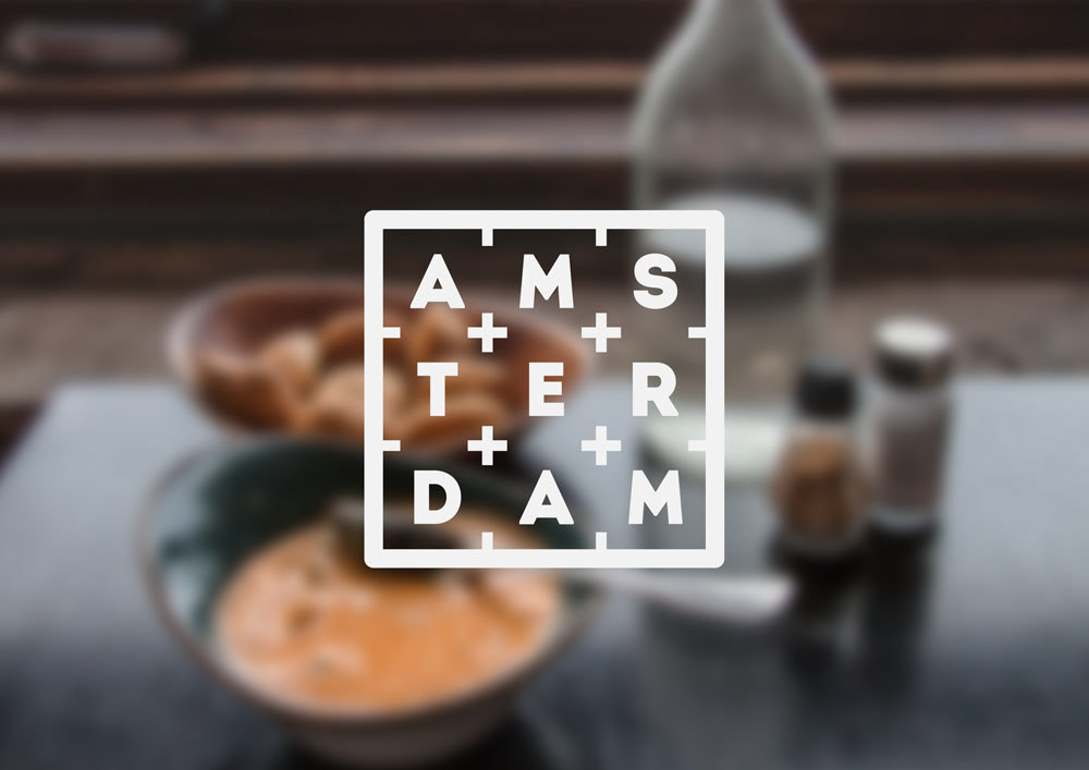
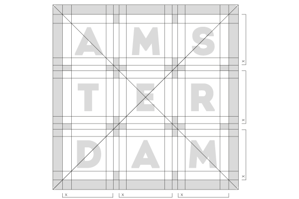
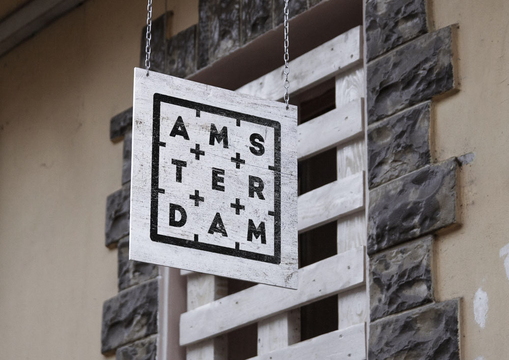
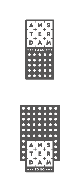
THE LOGO
The coat of arms of Amsterdam city contains three silver Saint Andrew's Crosses. I wanted to keep a reference to this number, which is why the name 'Amsterdam' is written in a 3-by-3 grid.
The logo has further alternatives (landscape, with and without 'Tanning & Cafe'), but an additional symbol (bringing in the cross) was also developed to be used as a complimentary design element.


--------------------
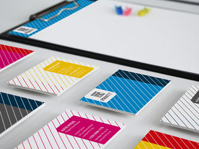
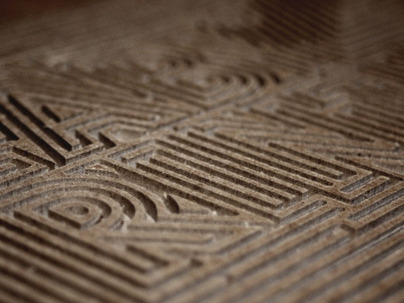
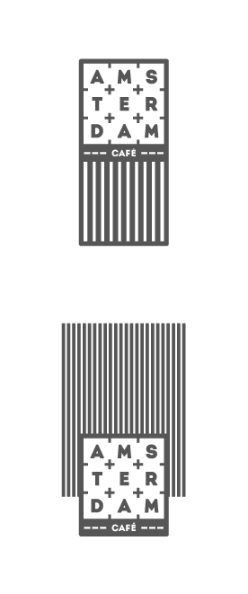
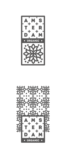
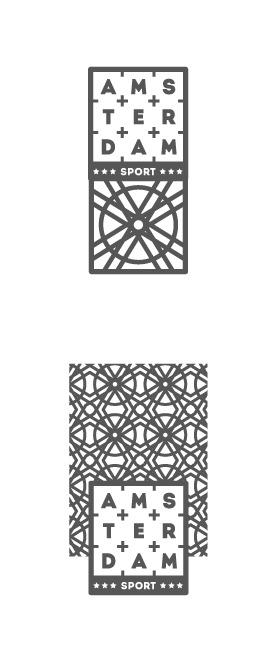
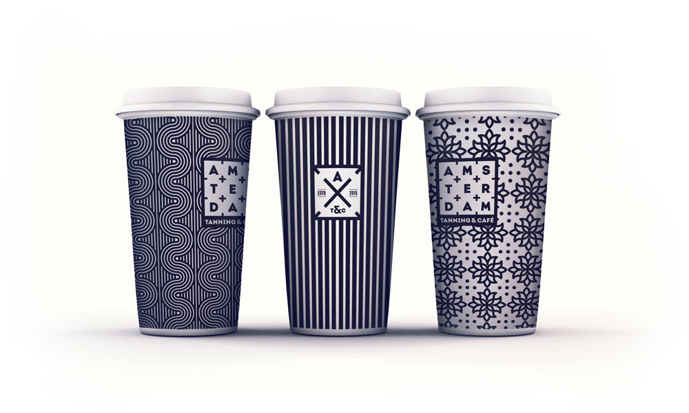
BRANCHES
The different branches of the 'Amsterdam' brand are signified by different patterns. Each pattern is conceptually connected to the specific branch it symbolizes.
BRANCHES
The different branches of the 'Amsterdam' brand are signified by different patterns. Each pattern is conceptually connected to the specific branch it symbolizes.
SUN

CAFE
ORGANIC
SPORT
TO GO
----------------------------------------


--------------------
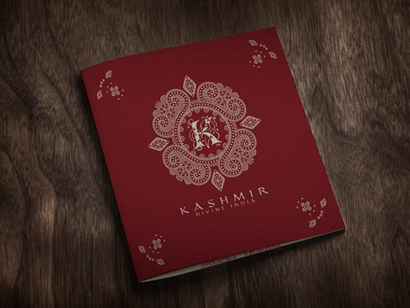
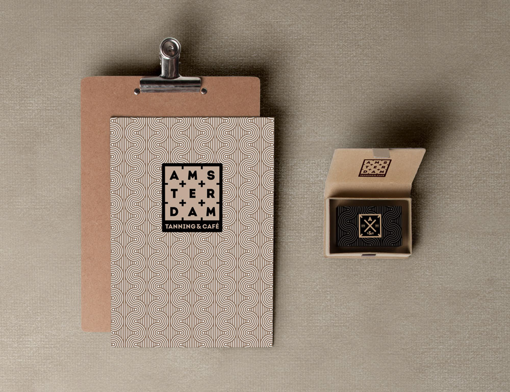
STATIONERY


--------------------
INTERIOR RENDERINGS
Used with kind permission from Amsterdam Tanning & Cafe.
All images ©Amsterdam Tanning & Cafe.


--------------------
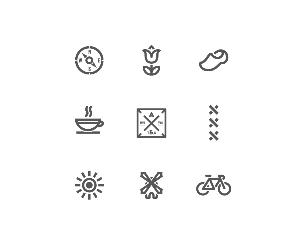
PICTOGRAMS
Some Amsterdam-related pictograms were designed additionally to complement the identity.

THANK YOU FOR WATCHING!
For news and updates follow me on facebook.
For news and updates follow me on facebook.